Day 6 of The 30 Day Coloring Challenge – Just playing.

I had a card in mind with one of my awesome Power Poppy digi’s.
And  if you hurry you can get these and other stamps
(clear and digital) on a massive sale right now!! https://powerpoppy.com/
For the card I printed the image on to Neenah cardstock several times.
Unfortunately what I wanted didn’t work. So the image was on my table and that was it.

Later in the week I was far behind reading blog posts and YouTube video that goes along with them, so I put my headphone on and read and watched. My daughter popped in and put several alcohol markers on my desk telling me she needed them again later but they were in her way.
Left from me the tulip image was laying on my desk and right some markers, that’s 1 + 1 for my brain.
I decided to play a little with two blue markers.
I loved how the image came out and wanted to go a step further, I outlined the image with a gold gel pen.
Finished I thought I’d done an awesome job, if you may say that from yourself LOL.

image
My first intention (earlier that week) was to print and heat emboss the tulip, but that didn’t work.
This was about the same look, although the lines are not as bold but I like this even more.

When finished I also knew immediately what I wanted to do with it.
I have a die that cuts 9 tiles and I thought this would be great with this image.
I taped my die on to the panel, first stamped the sentiment and then ran it through my Vagabond.

I let the pieces sit in the die, turned it around and put 1 mm. foam tape on every piece.
Turned it with the image right side up and placed it on slightly bigger blue metallic cardstock panel, with a little pressure I tipped the image pieces out of the die and adhered them in the same time.
I adhered the blue panel to a white base card.
And that’s how I finished my card that started by just playing with something that was on my desk.
I hope you enjoy the card as much as I did making  it.

The used materials are under the image and if you have any questions don’t hesitate to ask. The photo doesn’t do justice to the card, because of the blue metallic cardstock it was hard to make a good photo.
Kaart

Used Materials

Power Poppy Digital Image Tulips
Neenah Classic Crest White Cardstock
Alcohol markers in two blue shades
Gold Gel pen
Sizzix Die 658867-2 Grid Works
Dutch Text stamp unbranded
Dark Blue Tom Bow marker for stamping my sentiment
Blue Metallic Cardstock
Papicolor Cardstock White


Day 22 – Power Poppy

When I saw this awesome image by Kathy Racoosin aka The Daily Marker I Immediately fell in love with it. I’m talking about the awesome Dahlia XL stamp set from Power Poppy this stamp set can be bought in clear as well as digital.
And if you hurry you can get these and other stamps (clear and digital) on a massive sale right now!! https://powerpoppy.com/

I start stamping the clear stamp with Distress Spun Sugar because I wanted a no line colouring look, also I wanted a light under layer with the same ink. Therefore I first stamped the Dahlia on masking paper and carefully cut it out.
I placed my panel in to my stamping tool and I used the flower mask as a guide of where to place my stamp, closed my stamping tool and picked up the stamp with my door for later.
After that I placed the outline mask on top of my panel and with a blending brush I lightly gave the flower some pink colour, it’s hard to see in the picture right below. I placed the picture again on it’s own, so you can see it a little better. After that was dry, which was almost immediately, I stamped the flower.

Distress inkt aangebracht
I started colouring with my Polychromos pencils.
I had found an amazing picture of a pink with purple Dahlia on Internet and although it was a different Dahlia I used the same colour scheme.
I never had coloured a no line image before and the light in my craft room is not that good, so I decided that I only would colour this image by daylight and that amounted to one or two leaves a day.

After one and a half week I got an inflammation in my thumb joint. The inflammation wasn’t from the colouring but prevented me from colouring and it took a few weeks before I could colour again.
Although I had a deadline because I wanted to make this flower into a card for my sister’s birthday, I kept colouring slow but steady.
I loved colouring this beautiful image and saw it come to life under my hands, colouring petal by petal.

wip klaar

When the flower was coloured I wanted to make a very simple background and thought of stamping wooden planks behind the flower in a blue colour. Fortunately I tried it first on a scrap piece of paper, neither the stamp, nor the colour I had in mind suited the flower.
After trying out several things on scrap I decided to just make some simple stripes with Distress ink on the background. Therefore I needed my Dahlia mask again.
Although I was scared that I would ruin my image I used painters tape, Blueprint Sketch ink and a blending tool to make the broad stripes.

Of course it’s always better to make your background before colouring. I think I would have gone mad if something went wrong with my coloured flower, it took me so much time and effort to colour it.
But in this case I didn’t know exactly what kind of colour I wanted for my background, that’s the reason I did it after colouring.

And then I had to decide what to do with my sentiment. Nothing I tried was great, luckily on the same time I got a post from the Power Poppy website with their weekly challenge, this time they had two sketches and on one of them I found the solution. I made two strips with a fishtail for the top of the card with
stickers in Dutch which translates into Happy Birthday.

I adhered my panel to a slightly bigger card base from dark blue cardstock with 1 mm. foam tape and with 0.5 mm. foam tape I adhered the two sentiment strips on to the panel.
And that finished this card and I totally love how this card turned out.

The used materials are under the image and if you have any questions don’t hesitate to ask.

klaar

Used Materials

Neenah Classic Crest Solar White
Power Poppy Clear Stamp Dahlia XL (also available as digital stamp set)
Masking paper
Distress Ink Spun Sugar
Distress Blending Brushes
Polychromos Pencils 101 White – 119 Light Magenta – 125 Middle Purple Pink – 133 Magenta – 194 Red Violet – 129 Pink Madder Lake – 123 Fuchsia – 127 Pink Carmine – 225 Dark Red– 263 Caput Mortuum Violet – 109 Dark Chrome Yellow
Caran D’ache Luminance 001 White
Tombow Mono Zero Eraser
Kum Automatic Long Point pencil sharpener
Ranger Craft Sheet
TH Stamping tool
Distress Ink Blueprint Sketch
Distress Ink Blending Tool
Painters tape
Dark blue cardstock base card
Doodey Text Sticker DD1422 (Dutch)

Rose All Day card

I finally finished my card with this beautiful Power Poppy image and
can post it now the birthday girl received it.

I used a blue metallic cardstock for my base card and cut it slightly bigger
than the panel with the image. But only on the sides .
I glued the panel on top of this.

With a Dutch text stamp, which means a nice day, I added my sentiment.
I stamped it with Distress Oxide Salty Ocean, what is the same colour as the
Pencil, although I coloured that one with Distress Ink Salty Ocean.
The Oxide ink gives a better  stamping result than the regular Distress inks.
I used this Oxide colour to make it look like the text was written with the coloured pencil.

That’s it, I so love this beautiful image and I know for sure that I will use it often.
The used materials are under the image and if you have any questions, don’t hesitate to ask.

Kaart van de image
Used Materials

Canson Mixed Media Paper 98 lb
Power Poppy Digital Stamp Set Rose All Day
Distress Inks:
Abandoned Coral – Squeezed Lemonade – Worn Lipstick – Wilted Violet – Twisted Citron – Mowed Lawn – Grand Espresso – Peeled Paint – Forest Moss – Pine Needles – Tea Dye – Hickory Smoke –  Black Soot – Fossilized Amber and Salty Ocean.
Derwent Coloursoft pencils for the image; I used colours out of the same colour group and/or a shade darker than the ink.
Polychromos coloured pencils for the shadow around the image, I used 235 Cold Grey VI and 233 Cold Grey IV
Faber Castell Pitt Artist pens black fineliner XS
Metallic Blue Cardstock
Distress Oxide Salty Ocean
Marianne Design Stamp set EC0096 Eline’s Vintage Text NL.

A little Kathy magic and some shadows.

I finally finished the beautiful Power Poppy image, it took longer than I hoped but life and very warm weather got in the way.

As I mentioned before, (see here and here) this is a digital stamp set by Power Poppy and I have printed it on Canson Mixed Media Paper with a laser printer. If you print with a laser printer you are sure that the lines won’t bleed when you use Distress Ink and water, like I did for this image.

Working in several layers requires some patience because the previous one has to be dry before starting the next layer.
If there is anything I learned from Tim Holtz about Distress Ink it is that “wet on wet blends and wet on dry layers”, what is also true for most other mediums used with water. Therefore I worked on several flowers at the same time. With such small flowers and the way I coloured them the drying time is not very long.
When I wrote this post I noticed that I had forgotten to take a photo when I finished using the Distress ink. Hence a photo where I am half done, so that you can still compare it with the next photo.

Tweede plaatsing
After finishing all the colouring with my Distress Inks, I used what I call the Kathy Magic.
From Kathy Racoosin, @kathyrac or The Daily Marker, I learned to darken the nooks and crannies and to use coloured pencil to add more depth in the flowers (or any other image).
Kathy uses a black marker for the nooks and crannies most of the time, but that is something I didn’t dare. So I used dark pencil colours that matched my flowers or colours in the same colour group.

And then came the scary part, adding shadows around the whole image. I used pencils for that because I didn’t want to do it with my Distress ink. I was to scared that the dark ink would bleed into my image and   ruin it. Instead of black I used two of my darkest cold grey pencils.

+ potlood
When I finished the shadows I didn’t see them much and decided that I would go over my image lines with a XS black fineliner. And then my bouquet of flowers came to life again and I did see a hint of the shadow, just enough to give it a little dimension.
Next time I will colour the shadow before I colour the image, just like a possible background. This way I can’t ruin the colouring of my image.

The photos below are the same but with different light.
The used materials are under the photos and if you have any questions don’t hesitate to ask.

Klaar

Instagram

Used Materials

Canson Mixed Media Paper 98 lb
Power Poppy Digital Stamp Set Rose All Day
Distress Inks:
Abandoned Coral – Squeezed Lemonade – Worn Lipstick – Wilted Violet – Twisted Citron – Mowed Lawn – Grand Espresso – Peeled Paint – Forest Moss – Pine Needles – Tea Dye – Hickory Smoke –  Black Soot – Fossilized Amber and Salty Ocean.
Derwent Coloursoft pencils for the image; I used colours out of the same colour group and/or a shade darker than the ink.
Polychromos coloured pencils for the shadow around the image, I used 235 Cold Grey VI and 233 Cold Grey IV
Faber Castell Pitt Artist pens black fineliner XS


The 30 Day Coloring Challenge – Work in progress, a little bit further.

The Coloring Challenge is all about taking a little time each day for yourself to colour.
And that is what I do and enjoy! So still colouring the awesome Power Poppy digi with Distress Inks.
When this image is finished and I post it, I will also post the used materials.
If you have any questions in the meanwhile, don’t hesitate to ask.

Tweede plaatsing

The 30 Day Coloring Challenge – Work in progress

Unfortunately  I can’t colour long each day because of slight inflammation in both my wrists.
Hereby my work in progress, it’s a awesome Power Poppy digi and I am colouring with Distress Inks.
When this image is finished and I post it, I will also post the used materials.
If you have any questions in the meanwhile, don’t hesitate to ask.

1
Unfortunately the daylight did not really cooperate when I took this photo and I can’t change this anymore.

Sending smiles across the miles

Today I finished my decorated envelope I made especially for a card which I want to send to a friend who lives on the other side of the ocean. I got the idea to decorate the envelope when I received the mail from Hero Arts with the National Craft Month Challenge,  Dressing Up Envelopes.

I have a rule that says that I don’t post a card on my blog until the person for whom it was made has received it.
So the card is inside the envelope and I don’t show it now.

Envelop 1
I used the gorgeous digital image from Power Poppy. Unfortunately the digital stamps come only in jpg.format (no png.) so I had to remove the background first before I could place the flowers how I liked.
I also removed the heart of the flower in the front because I wanted to draw a smiling face on it.

After printing the image including the sentiment in  brown, I thought black would be too harsh, I coloured the flowers with my Polychromos pencils.
After colouring I added with a Artist Pitt Pen the eyes and the smile in the heart of the flower. To finish it I added a little white dot in the eyes with my gelly roll pen.
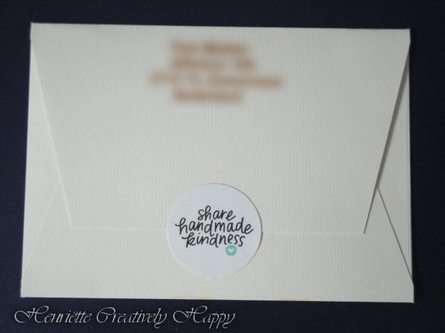
I closed the envelop with a sticker from Jennifer McGuire with her slogan “Share handmade kindness”.

The used materials are under the image and if you have any questions, don’t hesitate to ask.

Envelop 2

Used Materials

Envelope
Power Poppy digital stamp “Kindness Is The Way”.
Faber Castell Polychromos pencils : 101 White – 102 Cream – 107 Cadmium Yellow – 108 Dark Cadmium Yellow – 111 Cadmium Orange  – 121 Pale Geranium Lake – 188 Sanguine – 283 Burnt Siena – 263 Caput Mortuum Violet
Faber Castell Pit Artist Pen Black Fineliner
Sakura Gelly Roll pen White

The gorgeous digital stamp is a free download at Power Poppy, https://powerpoppy.com/
You can also learn for free, to colour these beauties at Kit and Clowder,  https://www.kitandclowder.com/