Happy 18e Birthday

Once again my health has prevented me from posting my card a week ago, as planned, sorry for that.

Open binnenkant
I stamped my Strawberry Swirl cupcake on to some copy paper because I wanted three cupcakes in two sizes and I only had one size. I scanned my stamped cup cake and in my drawing program I resized it and printed all three (the big one and two smaller ones).

I started this card with the idea to put the Giraffe I made earlier (see this post) on the front of the card. The inside I wanted to be a pop up card with cup cakes.
I had already started to colour the stamped cupcakes with my Polychromos pencils in different shades of pinkish reds and ochre. During the colouring I decided to make another panel for the front of the card because I didn’t know how to match the giraffe on the outside with the cup cakes on the inside.
Therefore I went through my stash of patterned papers and found two pieces of paper in pinkish red/yellow blending, what matched perfect to the cup cakes.
The stamps came out in a series and the Cupcake Pile Up stamp from the series was a great one to use on the patterned paper. I stamped and white heat embossed it double for a bolder look.

After I finished colouring the cupcakes I fussy cut them.
I stamped inside my top folded card 18 candles from the third stamp set in this series.
I coloured the candles with the same colours as I used for my cup cakes.

producten
The second piece of the patterned paper I glued to white cardstock and die cut letters for my sentiment.
I glued the word Gefeliciteerd (Congratulations in Dutch) in a half circle in the card.
I didn’t have a die cut that was large enough for my numbers so I printed them and cut them out of brown cardstock. I made two small slits in the biggest cupcake, put some glue just above the slits and put the numbers a little bit in to the slits and adhered them at the same time. Now it looks like they are in the topping.

I cut, folded and glued my pop-up elements on to the inside of the card and glued my cupcakes to them.
The pop-up elements are simple rectangles that you glue slightly before the fold line of the card with the smallest side and the larger side you glue on to the side of the card that opens up.

Cupcake klaar
I made my sentiment Tijd voor taart! in Dutch which translates into Time for cake!  on my computer because the stamp I had wasn’t the right size and I wanted to have white letters on a black background.
And by adhering my sentiment with foam tape to front of my card I finished the card and I love how it all came out.
The used materials are under the image and if you have any questions don’t hesitate to ask.

voorkant
Used Materials

White cardstock
Do Crafts Stamp sets PMA907203 Strawberry Swirl, PMA907202 Cup Cake Pile Up
and PMA909200 Mix and Match
Pattern Paper
Versafine Ink Onix Black
VersaMark Ink for embossing
Ranger Embossing Powder Superfine detail White
Faber Castell Polychromos Pencils
Marianne Design Die sets CR1281 Mini Alphabet

Day 22 – Power Poppy

When I saw this awesome image by Kathy Racoosin aka The Daily Marker I Immediately fell in love with it. I’m talking about the awesome Dahlia XL stamp set from Power Poppy this stamp set can be bought in clear as well as digital.
And if you hurry you can get these and other stamps (clear and digital) on a massive sale right now!! https://powerpoppy.com/

I start stamping the clear stamp with Distress Spun Sugar because I wanted a no line colouring look, also I wanted a light under layer with the same ink. Therefore I first stamped the Dahlia on masking paper and carefully cut it out.
I placed my panel in to my stamping tool and I used the flower mask as a guide of where to place my stamp, closed my stamping tool and picked up the stamp with my door for later.
After that I placed the outline mask on top of my panel and with a blending brush I lightly gave the flower some pink colour, it’s hard to see in the picture right below. I placed the picture again on it’s own, so you can see it a little better. After that was dry, which was almost immediately, I stamped the flower.

Distress inkt aangebracht
I started colouring with my Polychromos pencils.
I had found an amazing picture of a pink with purple Dahlia on Internet and although it was a different Dahlia I used the same colour scheme.
I never had coloured a no line image before and the light in my craft room is not that good, so I decided that I only would colour this image by daylight and that amounted to one or two leaves a day.

After one and a half week I got an inflammation in my thumb joint. The inflammation wasn’t from the colouring but prevented me from colouring and it took a few weeks before I could colour again.
Although I had a deadline because I wanted to make this flower into a card for my sister’s birthday, I kept colouring slow but steady.
I loved colouring this beautiful image and saw it come to life under my hands, colouring petal by petal.

wip klaar

When the flower was coloured I wanted to make a very simple background and thought of stamping wooden planks behind the flower in a blue colour. Fortunately I tried it first on a scrap piece of paper, neither the stamp, nor the colour I had in mind suited the flower.
After trying out several things on scrap I decided to just make some simple stripes with Distress ink on the background. Therefore I needed my Dahlia mask again.
Although I was scared that I would ruin my image I used painters tape, Blueprint Sketch ink and a blending tool to make the broad stripes.

Of course it’s always better to make your background before colouring. I think I would have gone mad if something went wrong with my coloured flower, it took me so much time and effort to colour it.
But in this case I didn’t know exactly what kind of colour I wanted for my background, that’s the reason I did it after colouring.

And then I had to decide what to do with my sentiment. Nothing I tried was great, luckily on the same time I got a post from the Power Poppy website with their weekly challenge, this time they had two sketches and on one of them I found the solution. I made two strips with a fishtail for the top of the card with
stickers in Dutch which translates into Happy Birthday.

I adhered my panel to a slightly bigger card base from dark blue cardstock with 1 mm. foam tape and with 0.5 mm. foam tape I adhered the two sentiment strips on to the panel.
And that finished this card and I totally love how this card turned out.

The used materials are under the image and if you have any questions don’t hesitate to ask.

klaar

Used Materials

Neenah Classic Crest Solar White
Power Poppy Clear Stamp Dahlia XL (also available as digital stamp set)
Masking paper
Distress Ink Spun Sugar
Distress Blending Brushes
Polychromos Pencils 101 White – 119 Light Magenta – 125 Middle Purple Pink – 133 Magenta – 194 Red Violet – 129 Pink Madder Lake – 123 Fuchsia – 127 Pink Carmine – 225 Dark Red– 263 Caput Mortuum Violet – 109 Dark Chrome Yellow
Caran D’ache Luminance 001 White
Tombow Mono Zero Eraser
Kum Automatic Long Point pencil sharpener
Ranger Craft Sheet
TH Stamping tool
Distress Ink Blueprint Sketch
Distress Ink Blending Tool
Painters tape
Dark blue cardstock base card
Doodey Text Sticker DD1422 (Dutch)

Sending smiles across the miles

Today I finished my decorated envelope I made especially for a card which I want to send to a friend who lives on the other side of the ocean. I got the idea to decorate the envelope when I received the mail from Hero Arts with the National Craft Month Challenge,  Dressing Up Envelopes.

I have a rule that says that I don’t post a card on my blog until the person for whom it was made has received it.
So the card is inside the envelope and I don’t show it now.

Envelop 1
I used the gorgeous digital image from Power Poppy. Unfortunately the digital stamps come only in jpg.format (no png.) so I had to remove the background first before I could place the flowers how I liked.
I also removed the heart of the flower in the front because I wanted to draw a smiling face on it.

After printing the image including the sentiment in  brown, I thought black would be too harsh, I coloured the flowers with my Polychromos pencils.
After colouring I added with a Artist Pitt Pen the eyes and the smile in the heart of the flower. To finish it I added a little white dot in the eyes with my gelly roll pen.
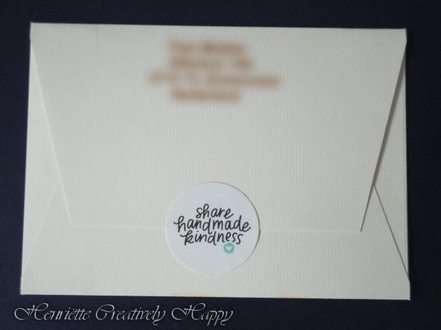
I closed the envelop with a sticker from Jennifer McGuire with her slogan “Share handmade kindness”.

The used materials are under the image and if you have any questions, don’t hesitate to ask.

Envelop 2

Used Materials

Envelope
Power Poppy digital stamp “Kindness Is The Way”.
Faber Castell Polychromos pencils : 101 White – 102 Cream – 107 Cadmium Yellow – 108 Dark Cadmium Yellow – 111 Cadmium Orange  – 121 Pale Geranium Lake – 188 Sanguine – 283 Burnt Siena – 263 Caput Mortuum Violet
Faber Castell Pit Artist Pen Black Fineliner
Sakura Gelly Roll pen White

The gorgeous digital stamp is a free download at Power Poppy, https://powerpoppy.com/
You can also learn for free, to colour these beauties at Kit and Clowder,  https://www.kitandclowder.com/

The Daily Marker Challenge Day 22

I have finished my Kit and Clowder Juli 2018 colouring class that I was started for  The Daily Marker Coloring Challenge. It was a lot of work but with almost every day a bit of colouring it was finished quicker than I thought it would be. And I am so happy with the result, it’s always great to see something grow bit by bit under your hands and see it becomes as you had in mind.
For me the challenge was drawing in some parts of this image, the rock wall and the shrubbery/foliage. This isn’t necessary because there is also a image where it’s already drawn in. Also the colouring of the black suit, colouring something black isn’t that easy as it seems to be.
The used materials are under the image and if you have any questions, don’t hesitate to ask.

K & C class Juli 2018 2
Used Materials

Faber Castell Polychromos Pencils
Canson Bristol Smooth Cardstock
Kit and Clowder Class July 2018
Image You and Me by Tiddlyinks

The Daily Marker Challenge Day 8

For The Daily Marker Coloring Challenge I am colouring with my Faber Castell Polychromos Pencils.
Although colouring with pencils is time-consuming I always have fun doing it.
Instead of using cardstock with a tooth, what makes it easier to layer the colour and blend, I am colouring on smooth cardstock. I wanted to give this a try and I like it. You have to be careful with your pressure. Best is very light, hold the pencil more on the end of it than by the point and in such angel that you won’t colour with only the point. This way it isn’t difficult to layer.

potlood

I hope to find time next week to finish this image.
For those who think that I forgot the space behind and close to the girl, she is getting a veil and then it’s easier to draw and colour that first.
Used materials are under the picture.

half af
Used Materials
Faber Castell Polychromos Pencils
Canson Bristol Smooth Cardstock
Kit and Clowder Class July 2018
Image You and Me by Tiddlyinks.


The Daily Marker Challenge Day 1

I am participating The Daily Marker Coloring Challenge, every time it is a lot of fun!
I will not post every little bit of colouring I do, most of the time I colour for about 10 – 30 minutes.
I will colour the image you can see here below with my Polychromos pencils. Colouring with pencils take time, that’s why I won’t show every day what I have done.
The image is from Tiddlyinks and I am follow a Kit and Clowder Class from July 2018 to colour.
blanc

Bloemen/Floral

De prachtige, gratis, bloemen kleurles van Kit and Clowder is af en ik heb er een kaart voor een vriendin haar verjaardag van gemaakt.
De tekst is met een tekenprogramma op de computer gemaakt.
Voordat ik de gekleurde image op de basiskaart geplakt heb, heb ik de randen met inkt bewerkt zodat deze laag iets naar voren kwam op de kaart.
Gebruikte materialen staan onder de foto.

Finished the gorgeous free floral colouring class from Kit and Clowder and made it in to a card for a friends birthday.
The Dutch text is made with a drawing program on my computer.
I put along the edges of the image layer a touch of ink so it stands out a little bit on the card base.
You can find the used materials under the image.

Afb. 3 met ongekleurde image

Gebruikte materialen/Used materials
https://www.kitandclowder.com/ – Kit and Clowder Free Floral Colouring Clas https://www.facebook.com/groups/kitandclowder/
Digital Image from Power Poppy  https://powerpoppy.com/
Canson Mi Teinte Pastel White paper
Faber Castell Polychromos Pencils
Joy Crafts Metallic Cartstock Blue
Memento Ink MD602 Teal Zeal

Klaar!/ Finished

De juni class is helemaal klaar, ik heb fouten gemaakt, nieuwe technieken geleerd maar vooral mijn potloden beter leren kennen en wat ik er mee kan doen of niet LOL. En ik heb genoten van elke stap, niet altijd 😜, maar wel voor het merendeel.
Ik heb ook een foto gemaakt van de image waar we mee gestart zijn, wat een wonder, wat je al niet kan bereiken met een Kit & Clowder Class + hulp en aanmoedigingen van Alyce Keegan + onze liefde voor kleuren!
De gebruikte materialen staan onder de foto.

Finished the June class, I made mistakes, I learned new techniques but most of all I get to know my pencils better and what I can do with them, or not LOL And of course I enjoy every stap, not always 😜 but most of the time.
I made also a photo of the clean image where we started with, what a wonder what whe can achieve with a Kid & Clowder Class + the help and encouragement from  Alyce Keegan + our love for colouring!
You can find the used materials under the image
Afbeelding 8Gebruikte materialen/Used materials
https://www.kitandclowder.com/ – Kit and Clowder Monthly Class June 2018
https://www.facebook.com/groups/kitandclowder/
Digital Image from Lee Holland https://www.etsy.com/nl/shop/LeeHIllustrations
Canson Canson Mi Teinte Pastel White
Faber Castell Polychromos

En hier ging het fout/And here it went wrong

De maandelijkse juni Class heb ik constant simultaan gekleurd. Natuurlijk wilde ik dat ook voor de achtergrond doen.
Tijdens het kleuren van het meisje was het al opgevallen dat ik niet lekker kon blenden op het Fluweel karton. Voor de stroke techniek ging het goed, maar het blenden niet.
Ik heb 6 uur gewerkt aan de lucht, lichte lagen en lagen potlood, toen de doezelaar gebruikt, dat werkte droog niet, toen de reukloze terpentine erbij gehaald, dat hielp een beetje maar ik zag nog steeds veel tooth (ongekleurd textuur van het papier). Nadat alles goed droog was heb ik mijn blending potlood erbij gepakt, vandaar dat het onderste deel van de lucht grijzer is. Dat hielp ook niet. Ik heb reuma en moest dus uitkijken voor mijn hand, arm en nek.
Mijn echtgenoot bood aan the helpen met de doezelaar te blenden en zo de tooth van het papier platter te maken, dat ging helemaal fout. De kleur kwam van het karton. Ik denk dat na alles wat ik had gedaan, de druk die hij uitoefende te veel was voor mijn kleurwerk. We denken dat de textuur van het karton te stug/stijf is en hebben het op een ander stukje karton die niet gekleurd was uitgeprobeerd en ook dit kregen we niet plat(ter).
Dus ik ben niet meer aan het gras begonnen, dat zou een verspilling van tijd en potloden zijn.
In volgend post kun je de image op het Canson papier zien die ik uiteraard wel heb afgemaakt.
De gebruikte materialen staan onder de foto.

The monthly class of June I was constantly colouring simultaneous. Of course I also wanted to do that for my background.
During colouring the girl I already had noticed that blending not went well on the Fluweel cardstock. For stroke technique it was good but blending not. I have worked over 6 hours on the sky with soft layers and layers of pencil, then the stump, that didn’t work, than odourless turpentine (same as Gamsol) that helped a little bit but still had a lot of tooth. After I was sure that everything was dry after the turpentine I used my blending pencil. That’s why the sky on the lowest part is greyer. That didn’t help either. I have rheumatism so I had to look out for my hand, arm and neck.
Than my husband said, let me try too flatten the tooth with the stump again, that was all wrong. The colour came of the paper, I think that after all the things I had done and then his pressure was to much for my colour work. We both think the cardstock is to firm, we tried with a stump on a not coloured piece if we could get the tooth flat but that didn’t work either.
I have not even tried the grass, that would be a waste of time and pencil.
I finished the other one, the one I coloured on Canson and that one you can see in another post.
You can find the used materials under the image
Afbeelding 7 FluweelGebruikte materialen/Used materials
https://www.kitandclowder.com/ – Kit and Clowder Monthly Class June 2018
https://www.facebook.com/groups/kitandclowder/
Digital Image from Lee Holland https://www.etsy.com/nl/shop/LeeHIllustrations
Fluweelkarton Wit ( Looks like the Elizabeth Crafts Soft Finish Cardstock)
Faber Castell Polychromos

Bijna klaar/Almost done

De poezen zijn klaar en ik vond het enig om de dieren te kleuren.
Nu alleen nog de achtergronden.
Nog steeds simultaan aan het kleuren, het Fluweel karton is de helder witte aan de rechterkant en het Canson papier is de linker.
De gebruikte materialen staan onder de foto.

The kittens are done, love those little animals to colour.
Now I only have to do the backgrounds.
Still colouring simultaneous, the Fluweel cardstock, is the bright white one on the right side and the Canson is the left one.
You can find the used materials under the image.

Afbeelding6
Gebruikte materialen/Used materials
https://www.kitandclowder.com/ – Kit and Clowder Monthly Class June 2018
https://www.facebook.com/groups/kitandclowder/
Digital Image from Lee Holland https://www.etsy.com/nl/shop/LeeHIllustrations
Canson Canson Mi Teinte Pastel White
Fluweelkarton Wit ( Looks like the Elizabeth Crafts Soft Finish Cardstock)
Faber Castell Polychromos